R Programming: World pupulation and most popular countries.
Skills
Author
Benjamini Mpinga
Published
April 15, 2023
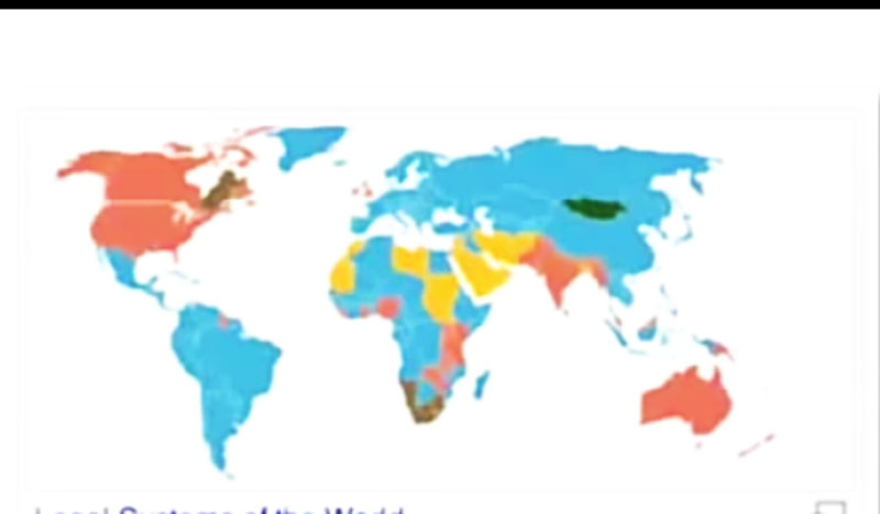
WORLD POPULATION DATA.
WORLD POPULATION DATA: This post is the result of R programming analysis, which basically demonstrate the most current world population of each continent and most popular countries within a continental level. R is a powerful language when it comes to analysis and documentation, this post is the one of R’s multiple way of communication. i have also generated pdf and word documents through from R Studio editor.
Questions.
Find the world’s most popular continent.
The most popular country in every continent.
The trend of the world population based on data given.
world’s population data from 1970 to 2022.
Data Summary.
The data below requires, to find the most popular continent on Earth, the most popular country on Earth and the general population growth trend. So we are going to import our data in R studio then the next step is to look weather the data are tidy or not, if Yes then we straight move to answer the question and if Not then we need to tidy them so that we are able to use them.
Choosen packages.
Tidyverse::
readr::
Lubridate::
readxl::
magrittr::
janitor::
dplyr::
About the chosen package.
These packages are chosen specifically to handle all activities in this task. Each package functions accordingly. This packages provide several functions that are key tools to facilitate the coding. One can choose the way makes him or her relevant in doing activities in coding. Especially when it comes to package arrangements, firstly understanding of the result required, is usually every coder’s concerns. But how one apply the calling of packages differ from one another.
My self i prefer to call all the package in the very first Chunk, this is because i already know all the necessary function() I’ll be required to use when coding. So the mentioned package in this assignment are already set in a first chunk.
require(tidyverse)
Loading required package: tidyverse
-- Attaching core tidyverse packages ------------------------ tidyverse 2.0.0 --
v dplyr     1.1.1     v readr     2.1.4
v forcats   1.0.0     v stringr   1.5.0
v ggplot2   3.4.2     v tibble    3.2.1
v lubridate 1.9.2     v tidyr     1.3.0
v purrr     1.0.1
-- Conflicts ------------------------------------------ tidyverse_conflicts() --
x dplyr::filter() masks stats::filter()
x dplyr::lag()    masks stats::lag()
i Use the conflicted package (<http://conflicted.r-lib.org/>) to force all conflicts to become errors
Loading required package: janitor

Attaching package: 'janitor'

The following objects are masked from 'package:stats':

    chisq.test, fisher.test
require(magrittr)
Loading required package: magrittr

Attaching package: 'magrittr'

The following object is masked from 'package:purrr':

    set_names

The following object is masked from 'package:tidyr':

    extract
require(readr)require(readxl)
Data Entry.
world =read_csv("e:/my_staffs/Blogs/teneson/posts/Current-world-pop/The world population data/world_population.csv")
Rows: 234 Columns: 17
-- Column specification --------------------------------------------------------
Delimiter: ","
chr  (4): CCA3, Country, Capital, Continent
dbl (13): Rank, 2022 Population, 2020 Population, 2015 Population, 2010 Popu...

i Use `spec()` to retrieve the full column specification for this data.
i Specify the column types or set `show_col_types = FALSE` to quiet this message.
The table above has some input that can not be proper managed with R language, so we must clean them and left with what we are going to use to answer the question asked.
pop = world %>%clean_names() %>%select(-c(1:2, 4, 7:17)) %>%rename("population"=3)
con = pop %>%filter(continent =="Asia")con1 = pop %>%filter(continent =="Africa")con2 = pop %>%filter(continent =="North America")con3 = pop %>%filter(continent =="South America")con4 = pop %>%filter(continent =="Europe")con5 = pop %>%filter(continent =="Oceania")
Warning: The `size` argument of `element_line()` is deprecated as of ggplot2 3.4.0.
i Please use the `linewidth` argument instead.
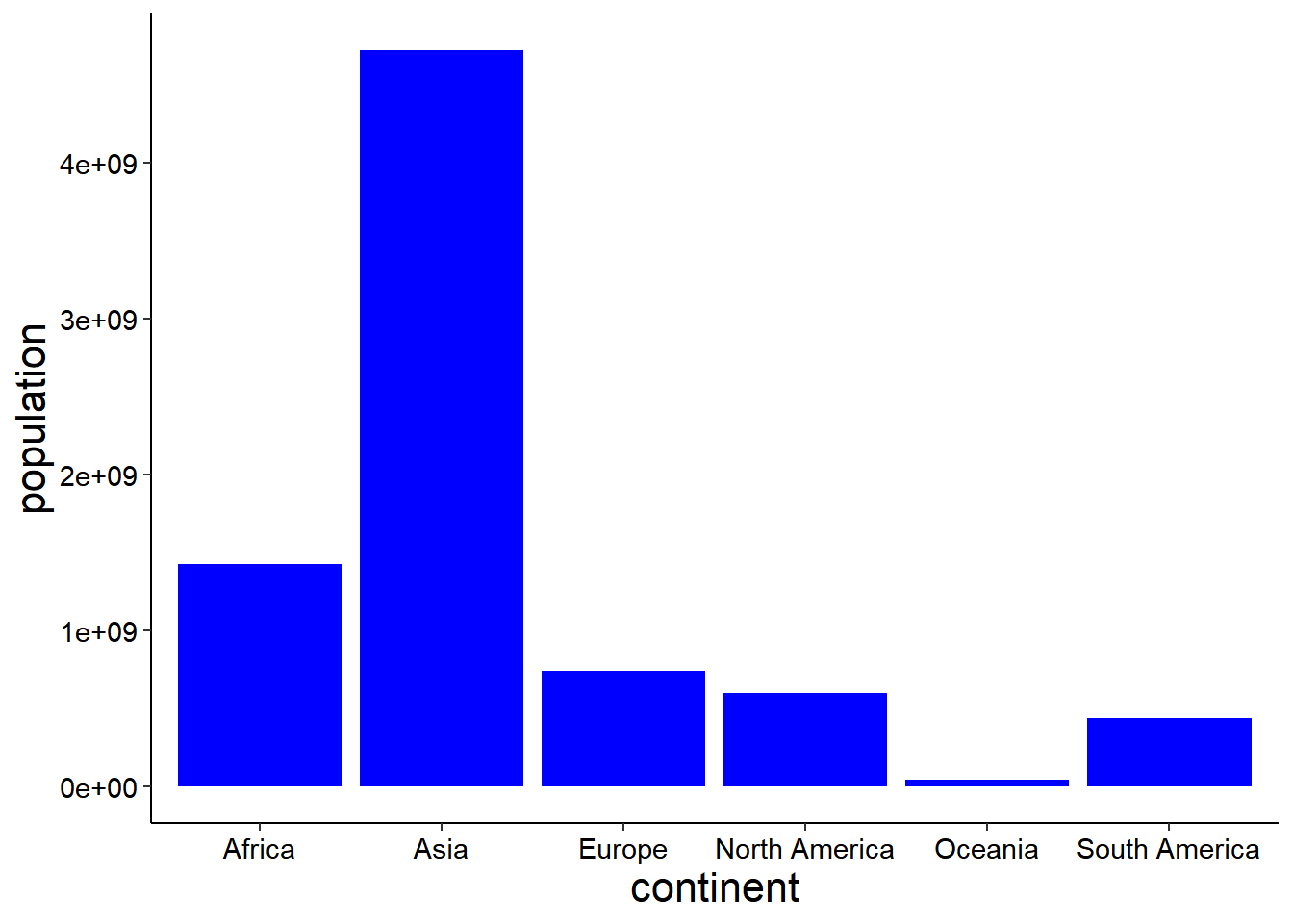
Finally a graph above demonstrate the world population by continent, the most to miner populated continent on Earth. Asia is leading the chart followed by Africa.
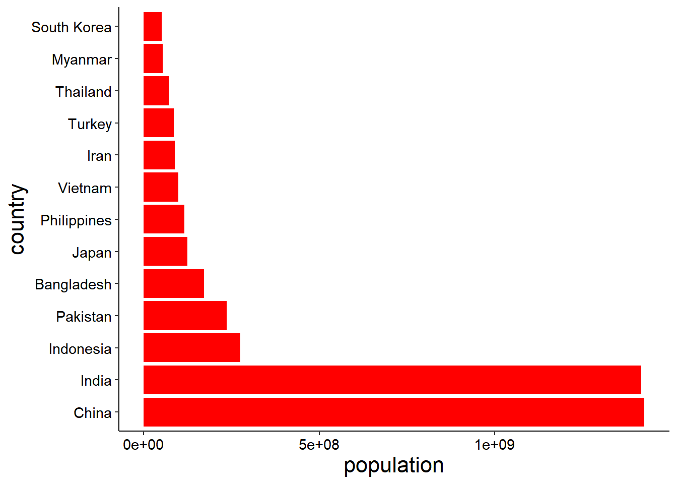
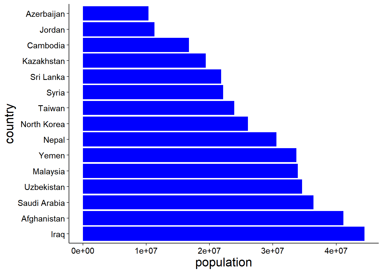
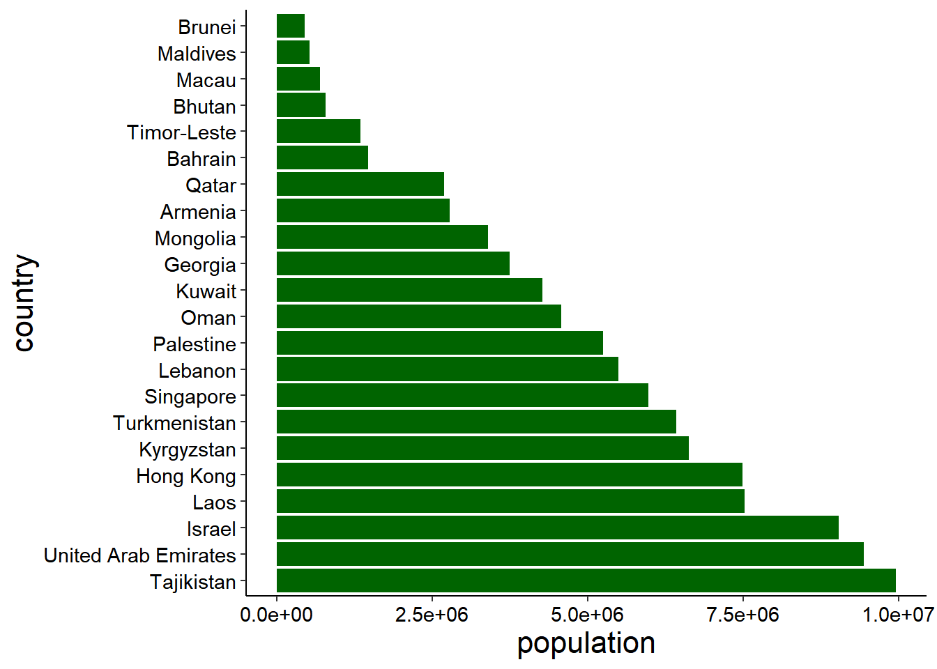
ASIA
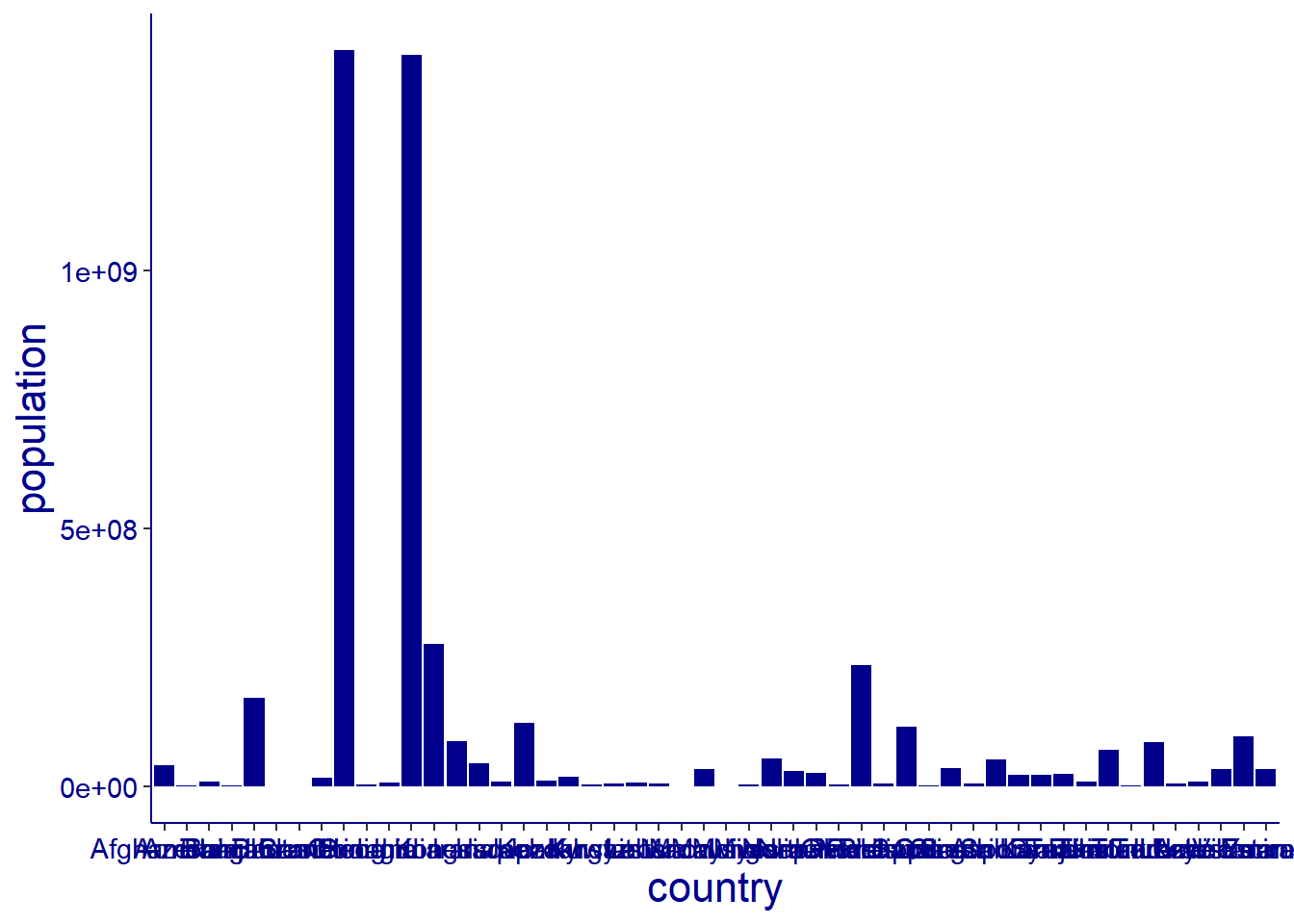
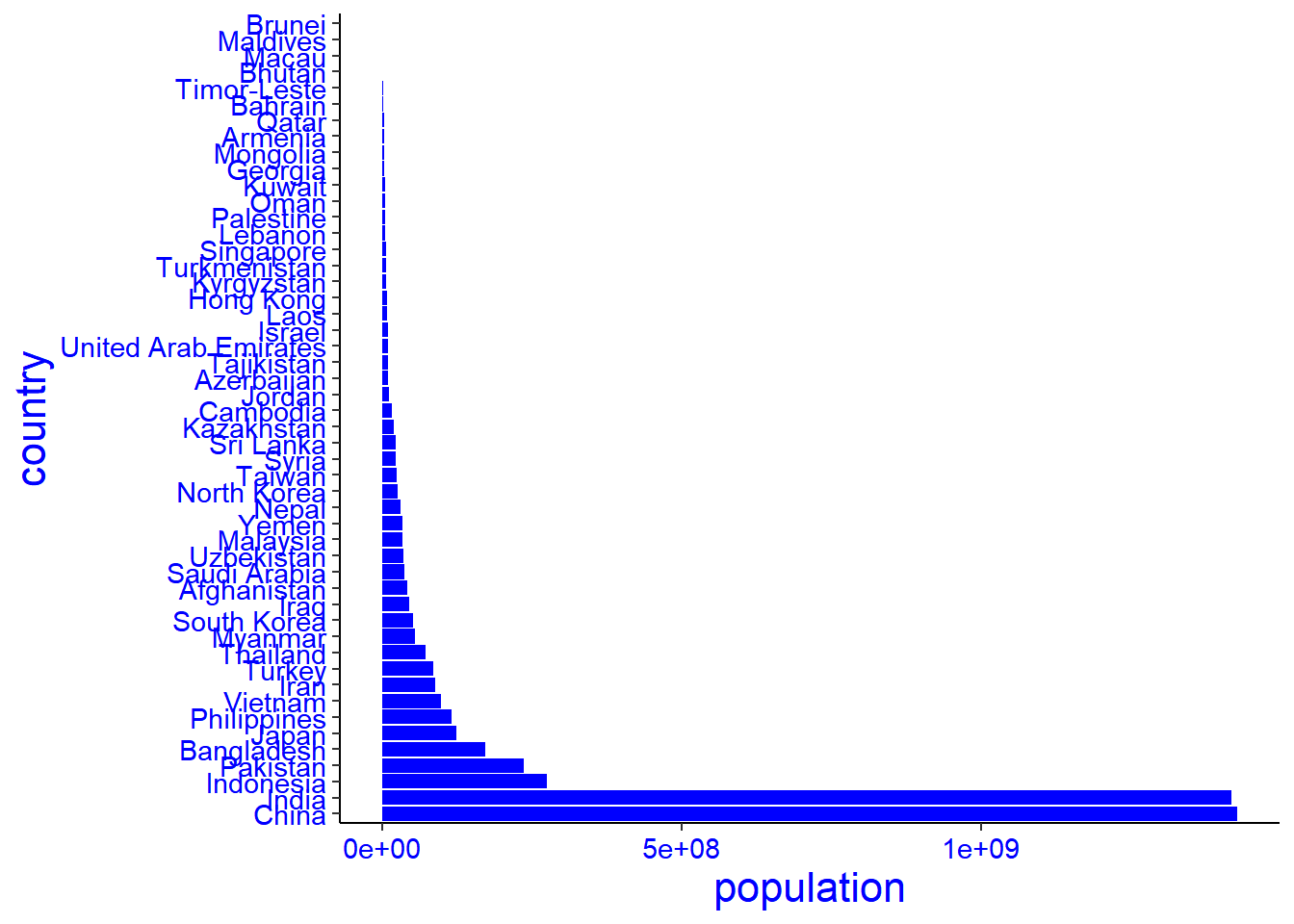
The graphs below show Asian continent population from high to low level, graph number one is not well arranged, sample were entered to the database the way they were collected, in fact without consideration of proper arrangement from the highest to the lowest number, it shows the original data, so we had to arranged it in an order that can be proper viewed In graph number two in ascending order. We use the function reorder() of the package tidyverse.
Therefor The Red graph shows countries with population more than Fifty millions, The Blue graph shows countries with population between Ten to Fifty millions, While the green graph shows the countries with less than Ten millions.
The first graph doesn’t allow eyes of the reader to relax when reading, So we have to generate another graph by flip our graph so that the names of the countries can be well viewed, we use the function Coord_flip() of the package tidyverse.
asia
# A tibble: 50 x 3
   country     continent population
   <chr>       <chr>          <dbl>
 1 Afghanistan Asia        41128771
 2 Armenia     Asia         2780469
 3 Azerbaijan  Asia        10358074
 4 Bahrain     Asia         1472233
 5 Bangladesh  Asia       171186372
 6 Bhutan      Asia          782455
 7 Brunei      Asia          449002
 8 Cambodia    Asia        16767842
 9 China       Asia      1425887337
10 Georgia     Asia         3744385
# i 40 more rows
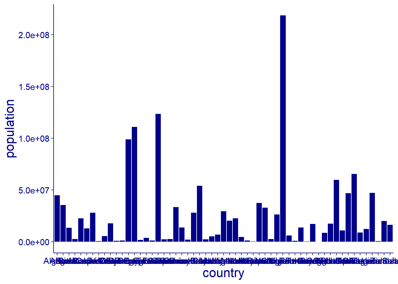
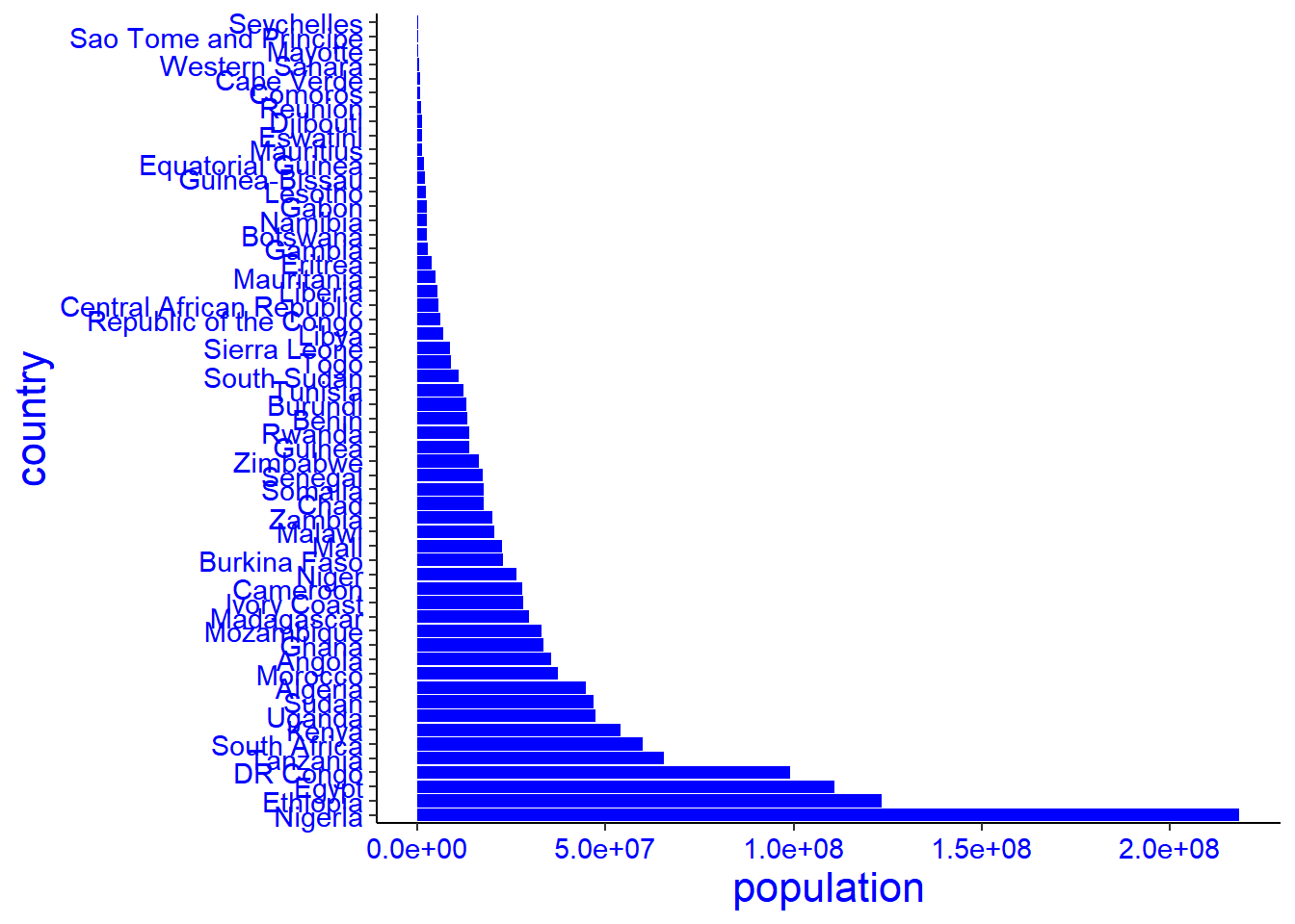
The graphs below show Africa continent population from high to low level, graph number one is not well arranged, sample were entered to the database the way they were collected, in fact without consideration of proper arrangement from the highest to the lowest number, it shows the original data, so we had to arranged it in an order that can be proper viewed In graph number two in ascending order. We use the function reorder() of the package tidyverse.
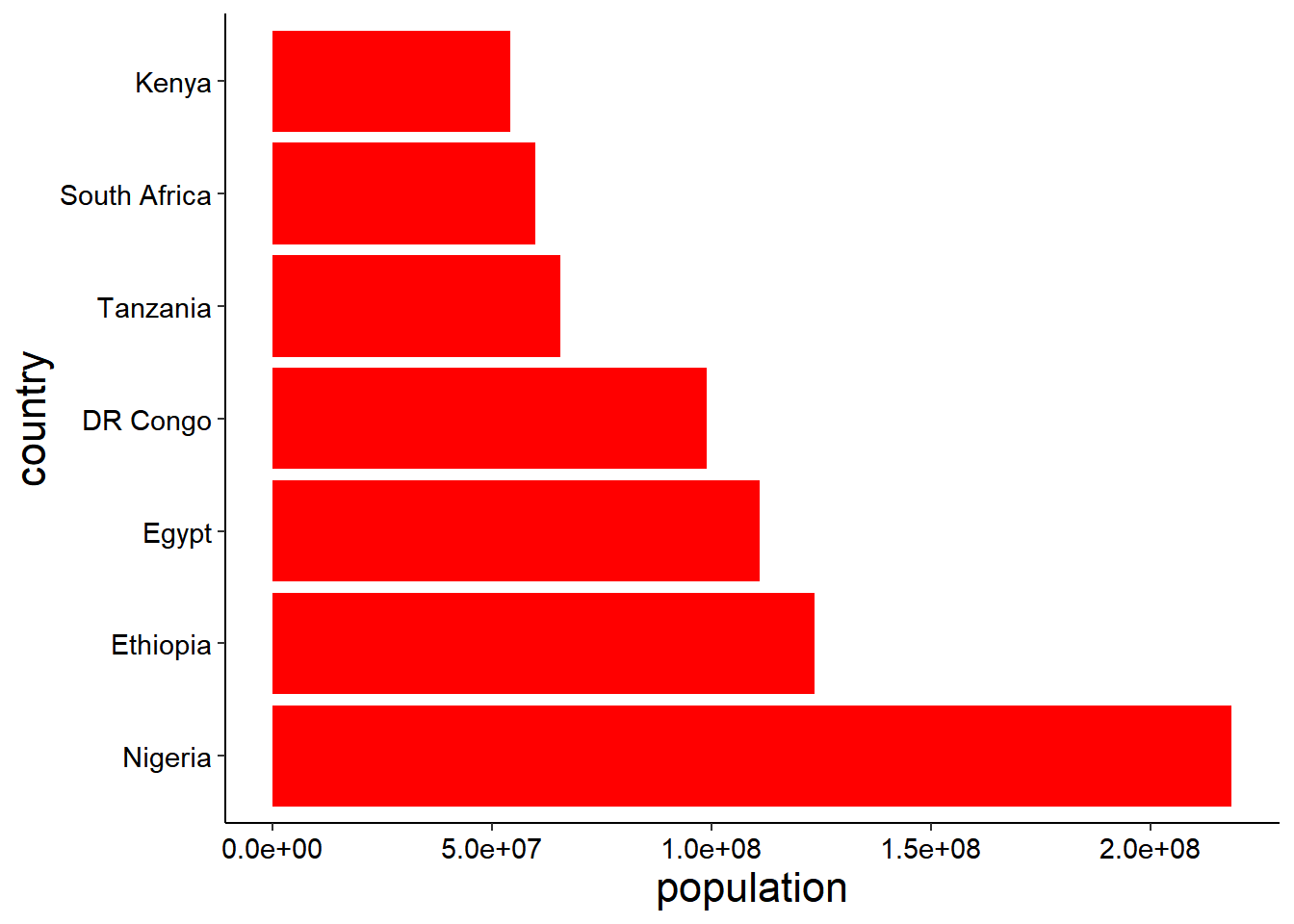
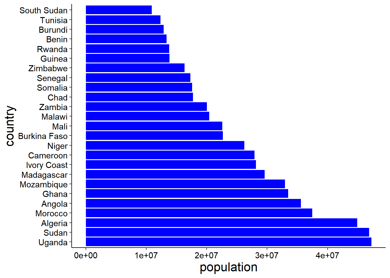
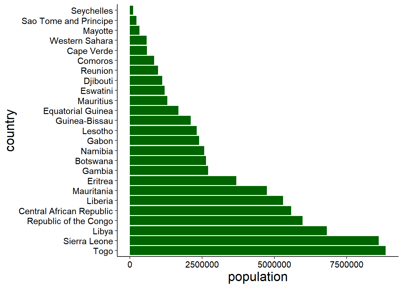
Therefor The Red graph shows countries with population more than Fifty millions, The Blue graph shows countries with population between Ten to Fifty millions, While the green graph shows the countries with less than Ten millions.
The first graph doesn’t allow eyes of the reader to relax when reading, So we have to generate another graph by flip our graph so that the names of the countries can be well viewed, we use the function Coord_flip() of the package tidyverse.
africa
# A tibble: 57 x 3
   country                  continent population
   <chr>                    <chr>          <dbl>
 1 Algeria                  Africa      44903225
 2 Angola                   Africa      35588987
 3 Benin                    Africa      13352864
 4 Botswana                 Africa       2630296
 5 Burkina Faso             Africa      22673762
 6 Burundi                  Africa      12889576
 7 Cameroon                 Africa      27914536
 8 Cape Verde               Africa        593149
 9 Central African Republic Africa       5579144
10 Chad                     Africa      17723315
# i 47 more rows
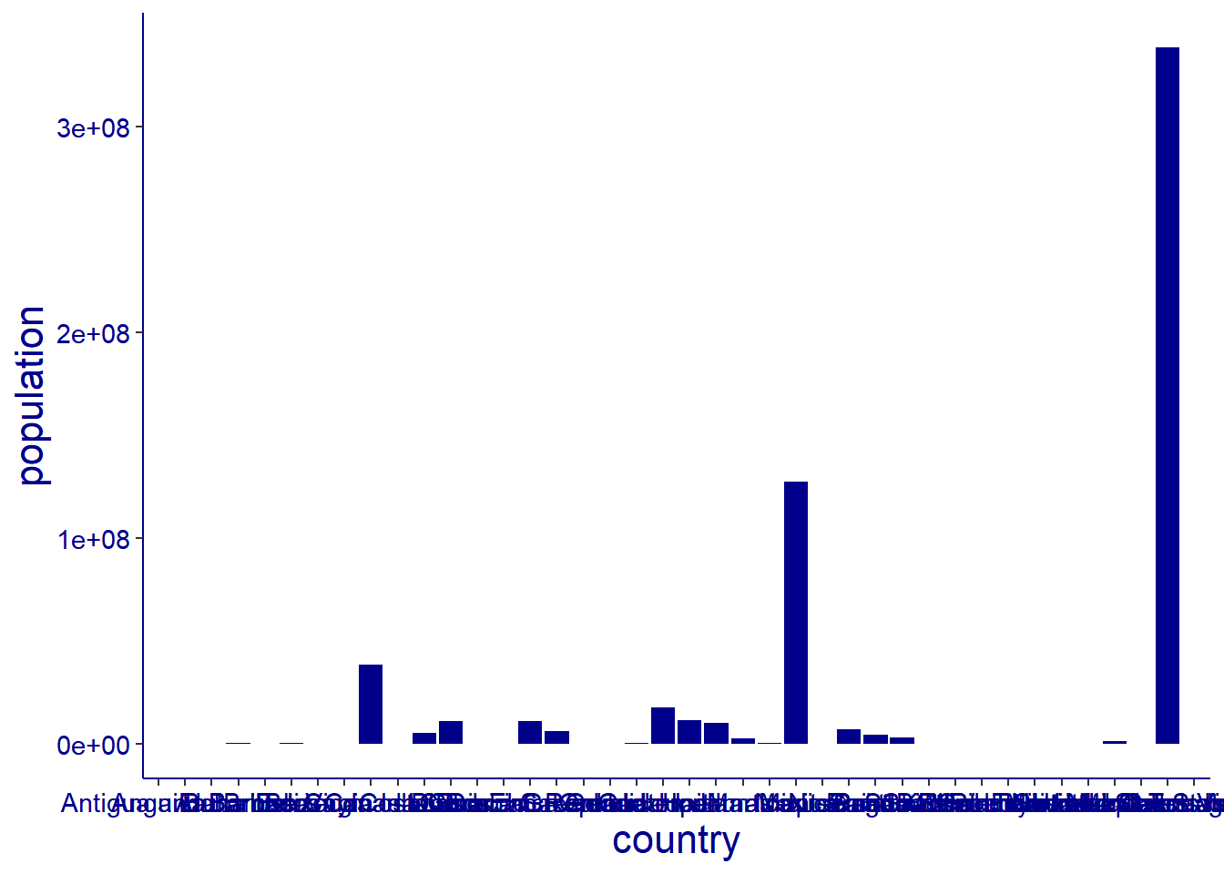
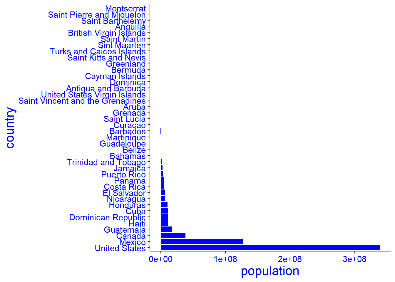
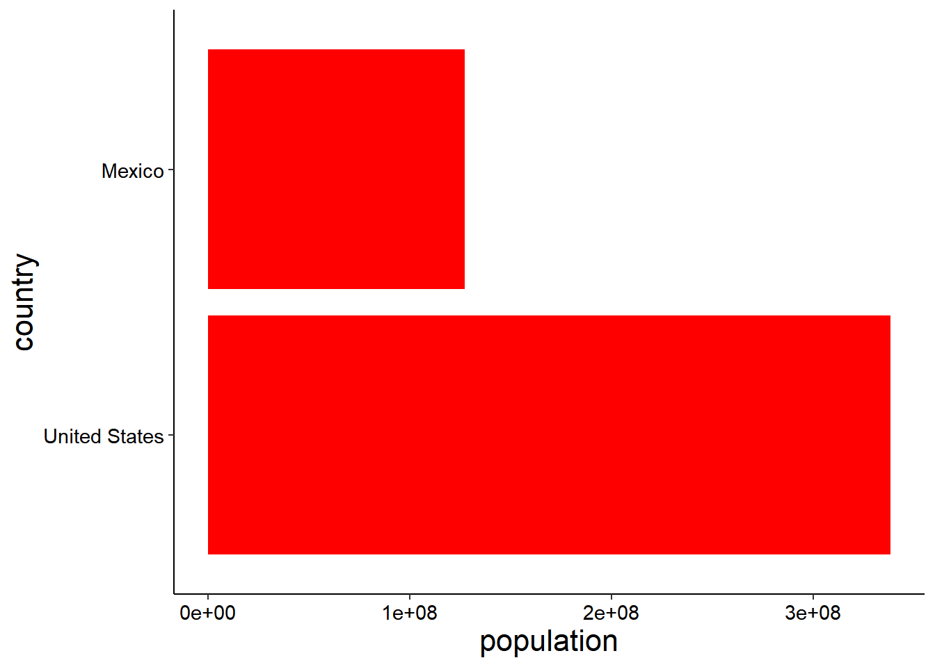
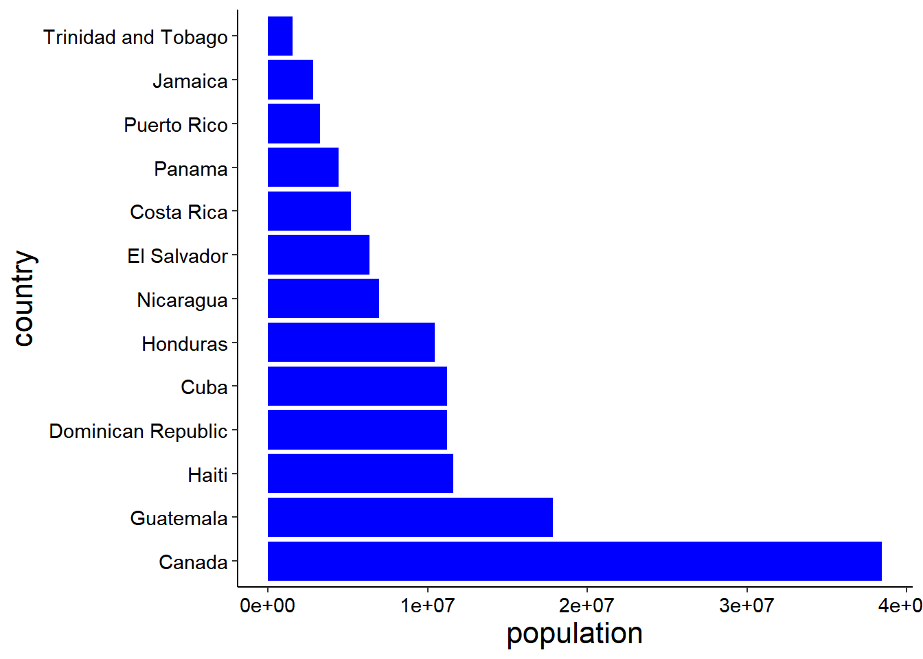
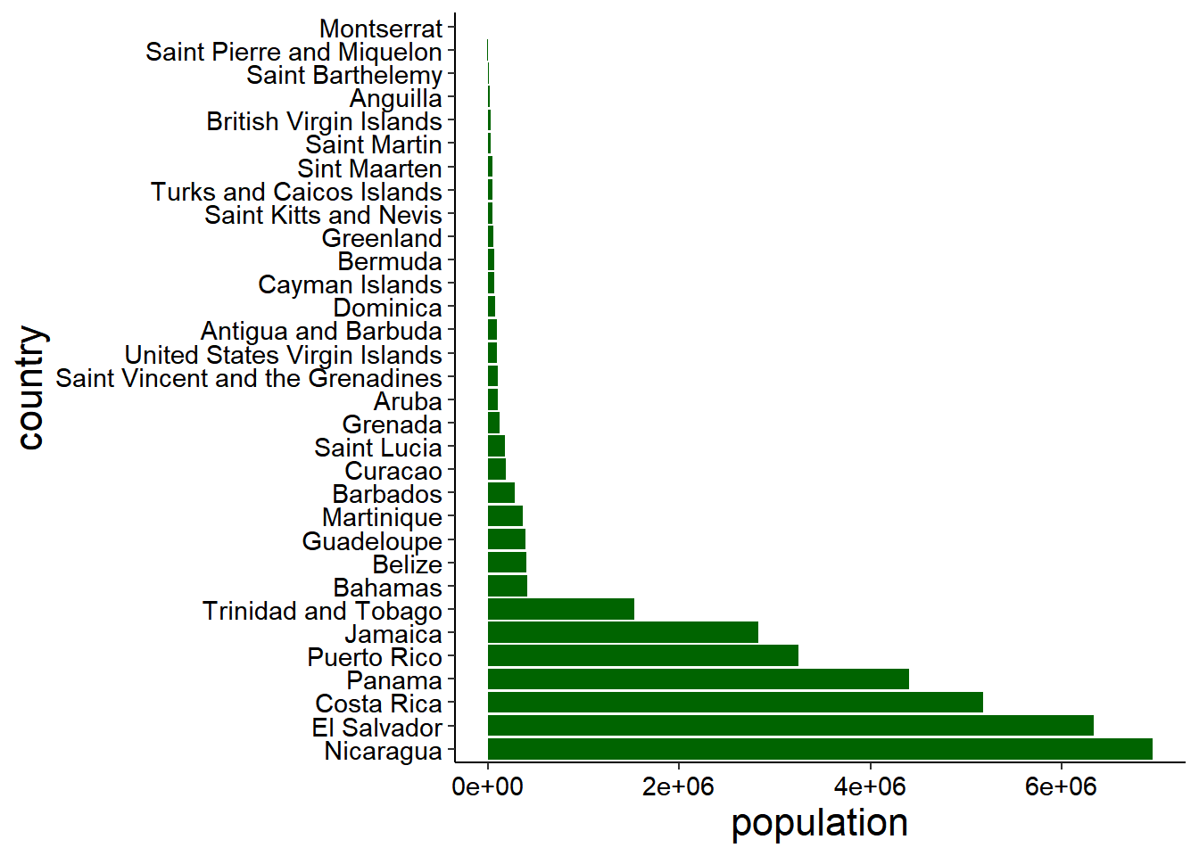
The graphs below show North America continent population from high to low level, graph number one is not well arranged, sample were entered to the database the way they were collected, in fact without consideration of proper arrangement from the highest to the lowest number, it shows the original data, so we had to arranged it in an order that can be proper viewed In graph number two in ascending order. We use the function reorder() of the package tidyverse.
Therefor The Red graph shows countries with population more than Fifty millions, The Blue graph shows countries with population between Ten to Fifty millions, While the green graph shows the countries with less than Ten millions.
The first graph doesn’t allow eyes of the reader to relax when reading, So we have to generate another graph by flip our graph so that the names of the countries can be well viewed, we use the function Coord_flip() of the package tidyverse.
notame
# A tibble: 40 x 3
   country                continent     population
   <chr>                  <chr>              <dbl>
 1 Anguilla               North America      15857
 2 Antigua and Barbuda    North America      93763
 3 Aruba                  North America     106445
 4 Bahamas                North America     409984
 5 Barbados               North America     281635
 6 Belize                 North America     405272
 7 Bermuda                North America      64184
 8 British Virgin Islands North America      31305
 9 Canada                 North America   38454327
10 Cayman Islands         North America      68706
# i 30 more rows
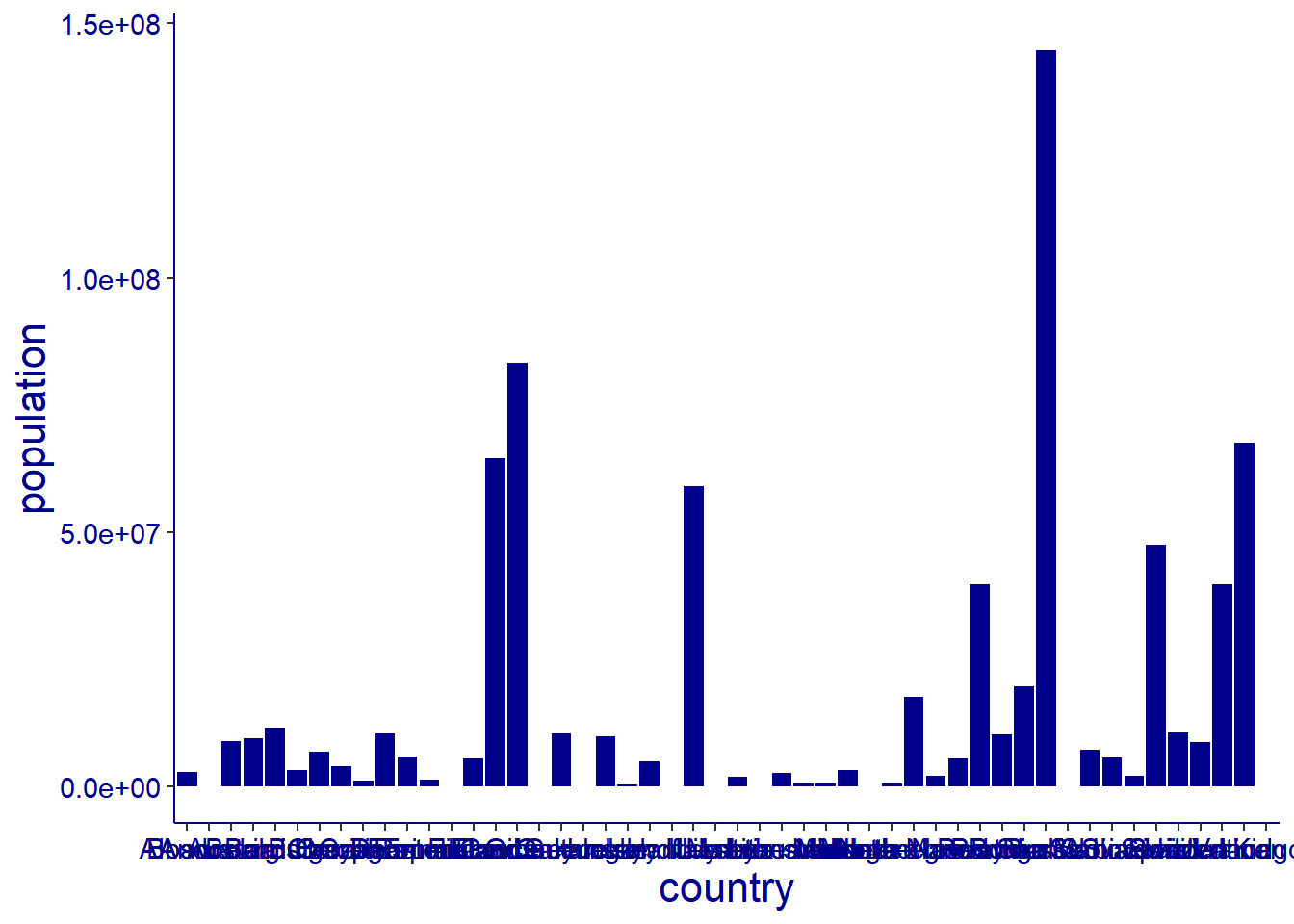
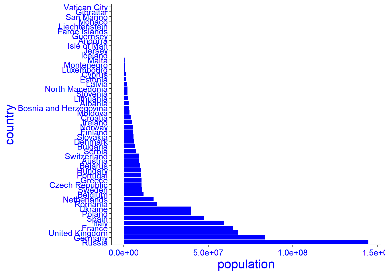
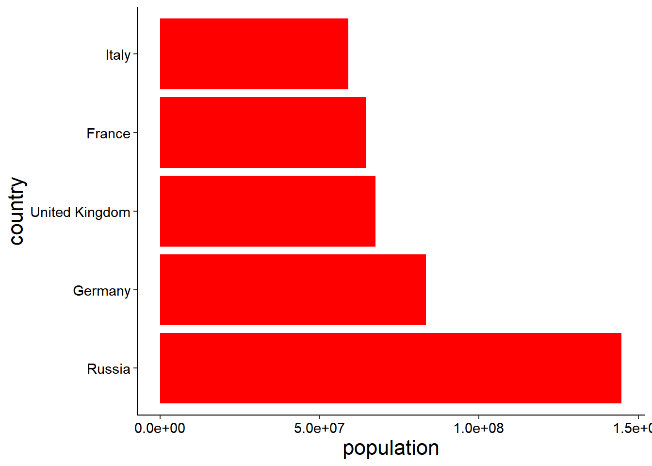
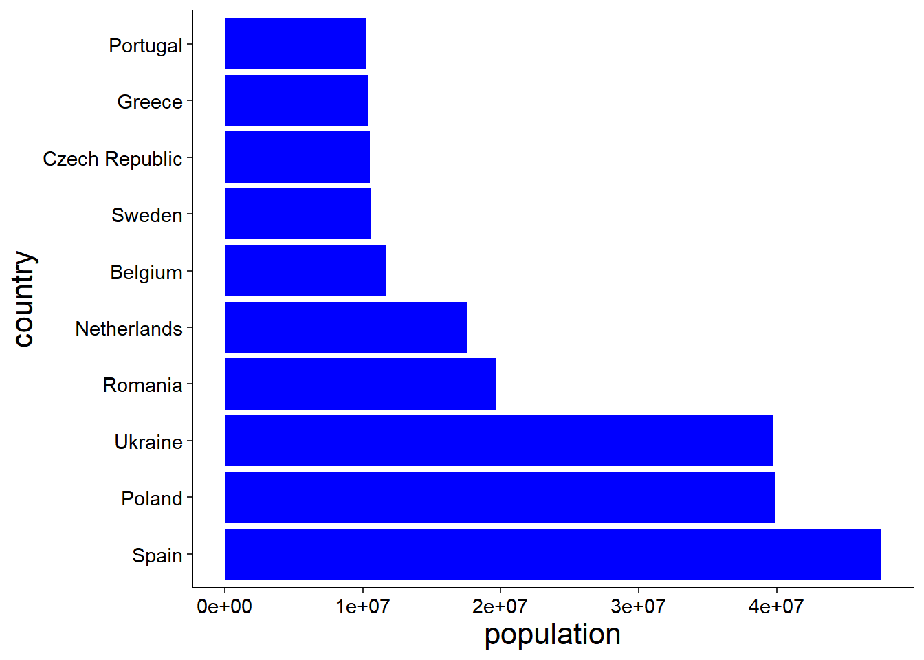
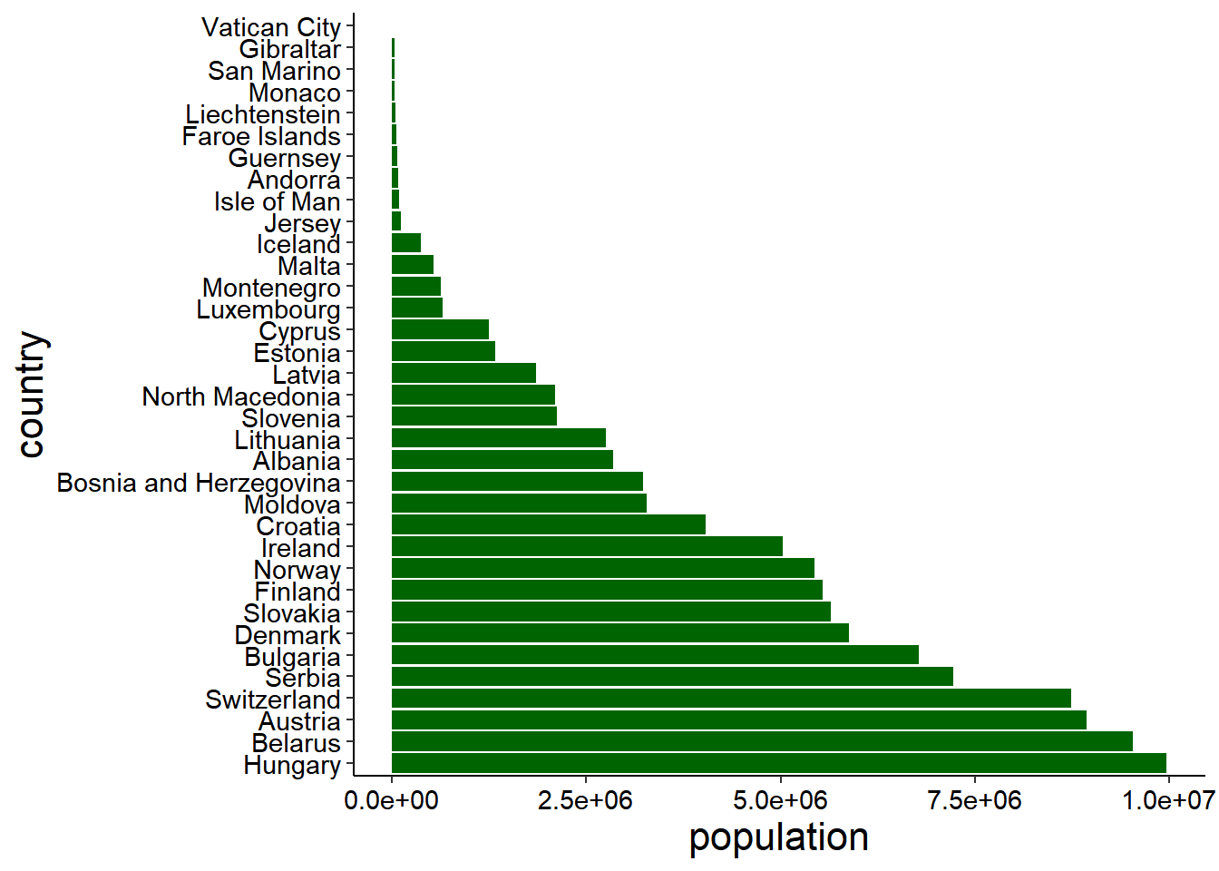
The graphs below show Europe continent population from high to low level, graph number one is not well arranged, sample were entered to the database the way they were collected, in fact without consideration of proper arrangement from the highest to the lowest number, it shows the original data, so we had to arranged it in an order that can be proper viewed In graph number two in ascending order. We use the function reorder() of the package tidyverse.
Therefor The Red graph shows countries with population more than Fifty millions, The Blue graph shows countries with population between Ten to Fifty millions, While the green graph shows the countries with less than Ten millions.
The first graph doesn’t allow eyes of the reader to relax when reading, So we have to generate another graph by flip our graph so that the names of the countries can be well viewed, we use the function Coord_flip() of the package tidyverse.
europe
# A tibble: 50 x 3
   country                continent population
   <chr>                  <chr>          <dbl>
 1 Albania                Europe       2842321
 2 Andorra                Europe         79824
 3 Austria                Europe       8939617
 4 Belarus                Europe       9534954
 5 Belgium                Europe      11655930
 6 Bosnia and Herzegovina Europe       3233526
 7 Bulgaria               Europe       6781953
 8 Croatia                Europe       4030358
 9 Cyprus                 Europe       1251488
10 Czech Republic         Europe      10493986
# i 40 more rows
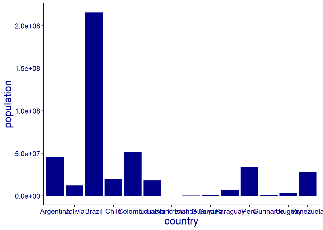
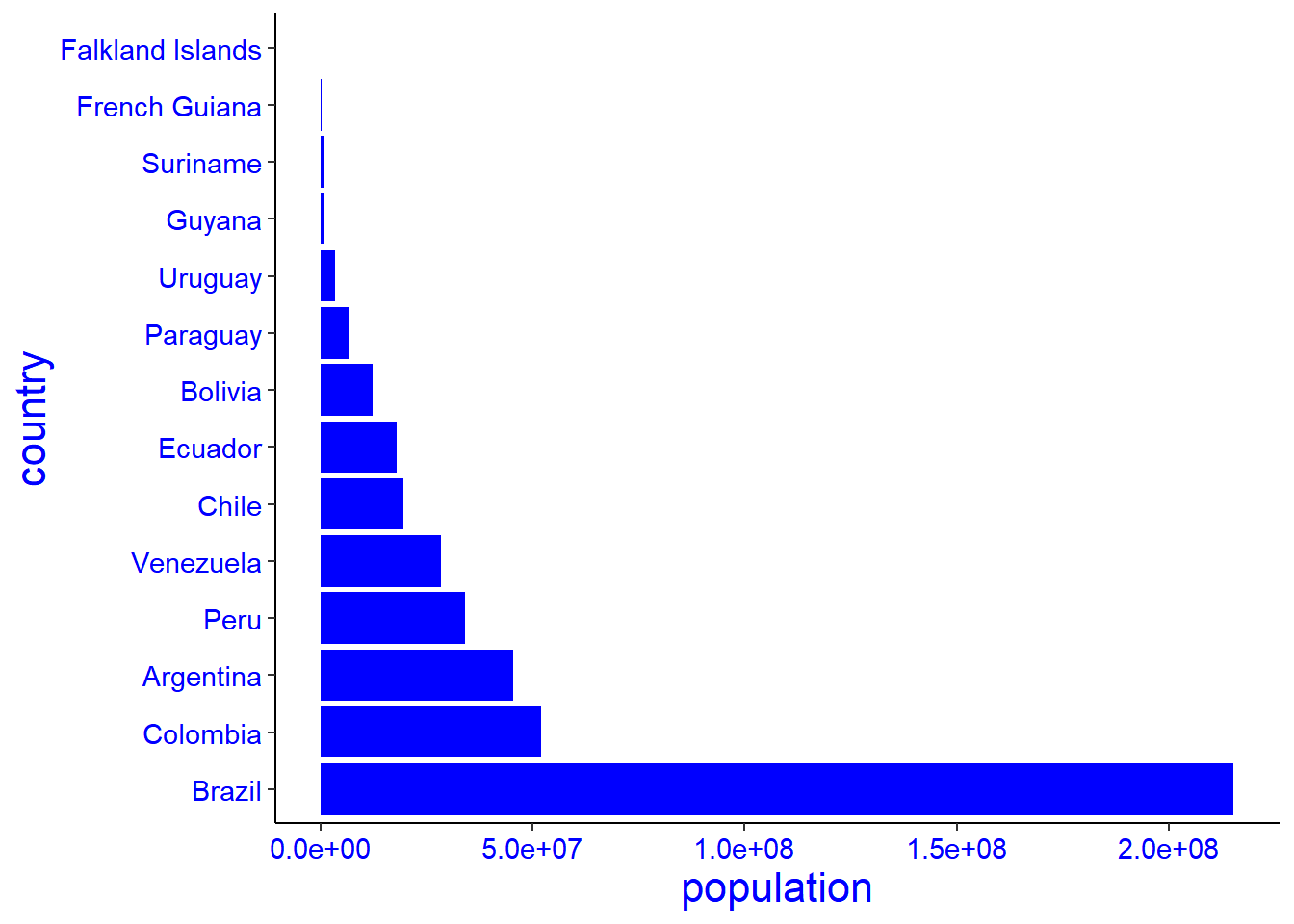
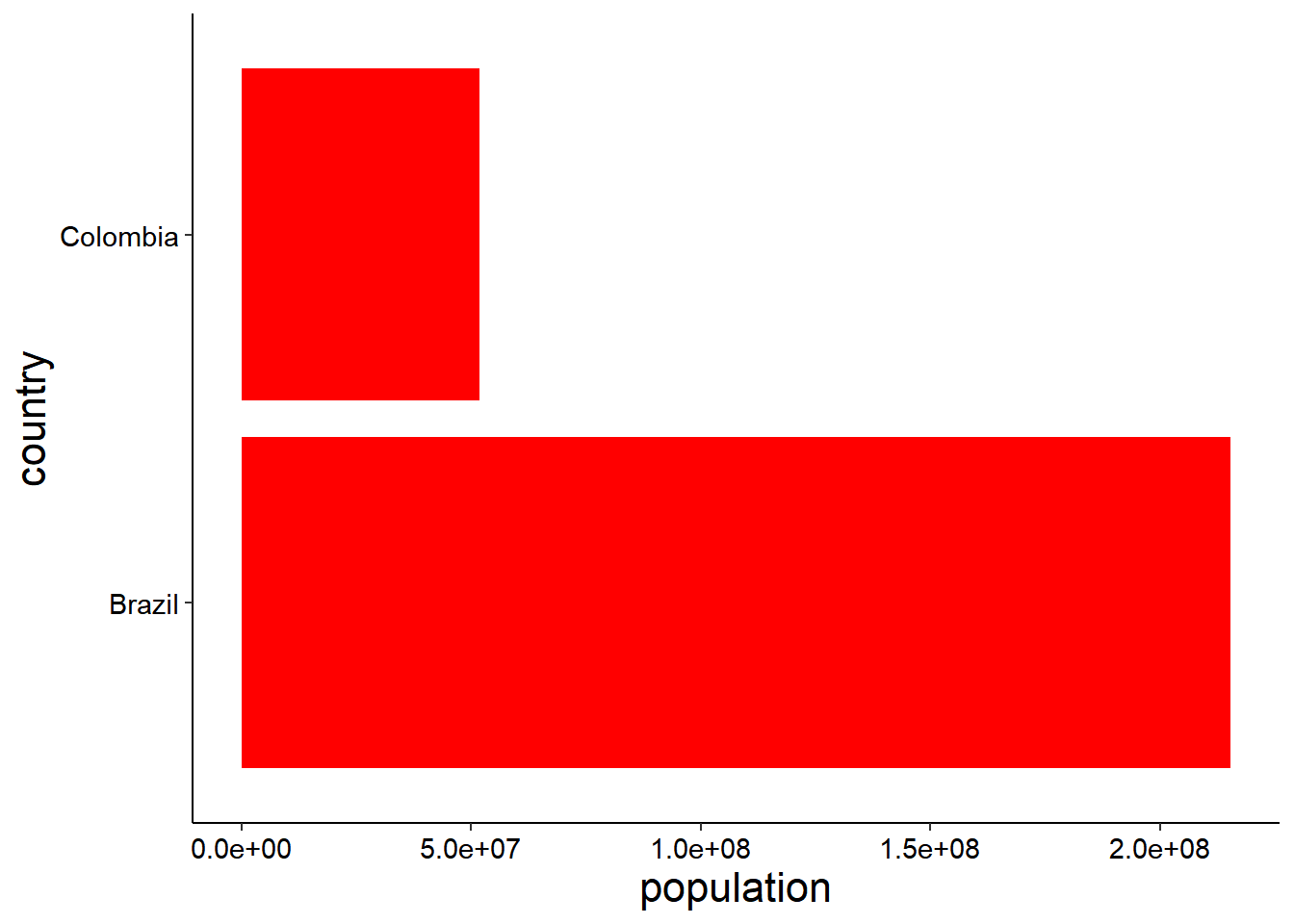
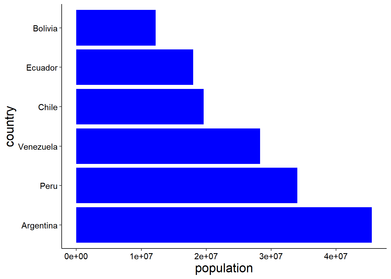
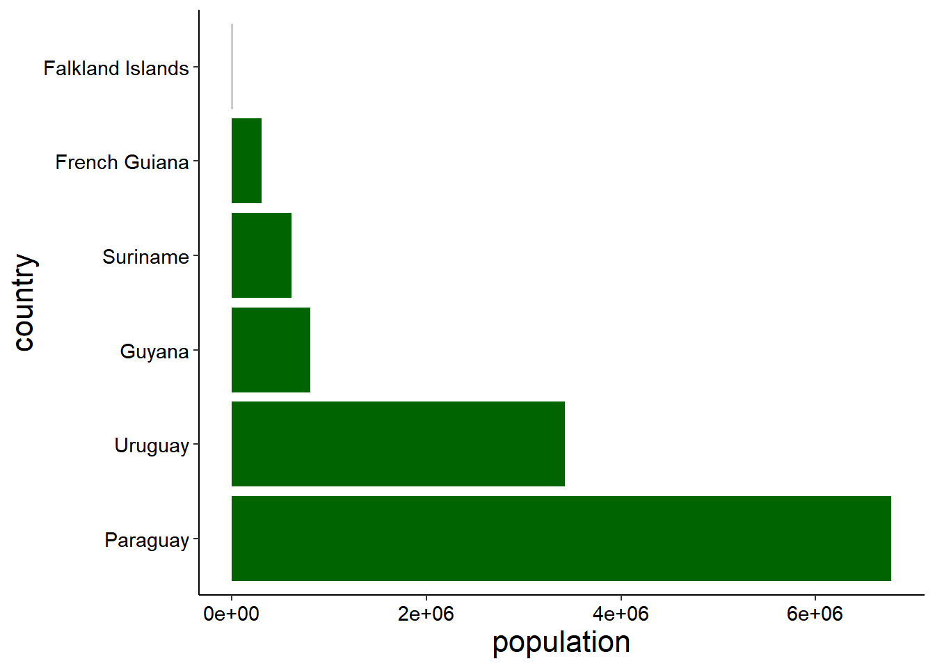
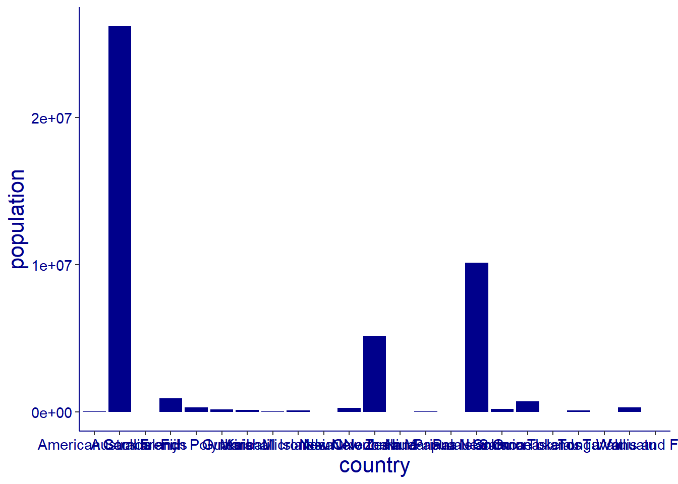
The graphs below show South America continent population from high to low level, graph number one is not well arranged, sample were entered to the database the way they were collected, in fact without consideration of proper arrangement from the highest to the lowest number, it shows the original data, so we had to arranged it in an order that can be proper viewed In graph number two in ascending order. We use the function reorder() of the package tidyverse.
Therefor The Red graph shows countries with population more than Fifty millions, The Blue graph shows countries with population between Ten to Fifty millions, While the green graph shows the countries with less than Ten millions.
The first graph doesn’t allow eyes of the reader to relax when reading, So we have to generate another graph by flip our graph so that the names of the countries can be well viewed, we use the function Coord_flip() of the package tidyverse.
sotame
# A tibble: 14 x 3
   country          continent     population
   <chr>            <chr>              <dbl>
 1 Argentina        South America   45510318
 2 Bolivia          South America   12224110
 3 Brazil           South America  215313498
 4 Chile            South America   19603733
 5 Colombia         South America   51874024
 6 Ecuador          South America   18001000
 7 Falkland Islands South America       3780
 8 French Guiana    South America     304557
 9 Guyana           South America     808726
10 Paraguay         South America    6780744
11 Peru             South America   34049588
12 Suriname         South America     618040
13 Uruguay          South America    3422794
14 Venezuela        South America   28301696
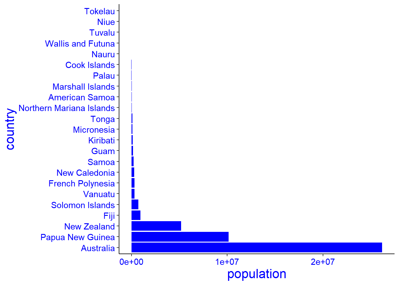
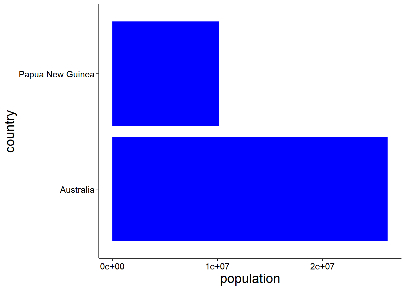
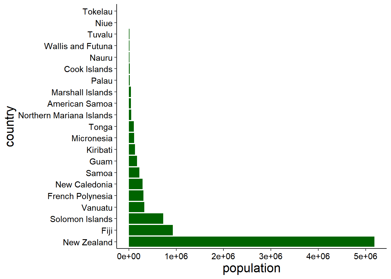
The graphs below show Oceania continent population from high to low level, graph number one is not well arranged, sample were entered to the database the way they were collected, in fact without consideration of proper arrangement from the highest to the lowest number, it shows the original data, so we had to arranged it in an order that can be proper viewed In graph number two in ascending order. We use the function reorder() of the package tidyverse.
Therefor The Red graph shows countries with population more than Fifty millions, The Blue graph shows countries with population between Ten to Fifty millions, While the green graph shows the countries with less than Ten millions.
The first graph doesn’t allow eyes of the reader to relax when reading, So we have to generate another graph by flip our graph so that the names of the countries can be well viewed, we use the function Coord_flip() of the package tidyverse.
ocean
# A tibble: 23 x 3
   country          continent population
   <chr>            <chr>          <dbl>
 1 American Samoa   Oceania        44273
 2 Australia        Oceania     26177413
 3 Cook Islands     Oceania        17011
 4 Fiji             Oceania       929766
 5 French Polynesia Oceania       306279
 6 Guam             Oceania       171774
 7 Kiribati         Oceania       131232
 8 Marshall Islands Oceania        41569
 9 Micronesia       Oceania       114164
10 Nauru            Oceania        12668
# i 13 more rows